Publish Date: March 8, 2026
In today’s digital marketplace, businesses face one unavoidable reality: most people access the internet through their phones. Smartphones are no longer secondary devices used only for quick searches or social media browsing. They are now the primary gateway for online discovery, research, and purchasing decisions. For businesses trying to attract attention online, this shift has created a new design standard known as mobile responsive design.
Companies that still treat mobile compatibility as an afterthought risk losing traffic, customers, and credibility. On the other hand, organisations that prioritise mobile responsive design gain a competitive edge in search rankings, customer engagement, and conversion performance.
This article explains why mobile-first thinking has become essential for modern websites and how mobile responsive design directly influences user behaviour, search visibility, and business growth.
The Shift Toward Mobile Browsing
Over the past decade, internet usage patterns have changed dramatically. Desktop browsing once dominated online activity, but smartphones have steadily taken the lead. In Australia, this trend is particularly clear. According to the Australian Communications and Media Authority, 91% of Australians access the internet using a smartphone, making mobile devices the most common way people go online. Today, mobile devices account for the majority of global website traffic.
This change happened for several reasons:
- Smartphones became more powerful and affordable
- Mobile internet connections improved significantly
- Consumers prefer browsing while travelling, commuting, or relaxing at home
For businesses, this shift means one thing: websites must perform perfectly on small screens.
If a visitor lands on a website that requires zooming, excessive scrolling, or slow loading times, they will leave within seconds. This behaviour is especially common among mobile users who expect instant access to information.
A properly implemented mobile responsive design ensures that websites automatically adapt to different screen sizes, providing a consistent experience across smartphones, tablets, laptops, and desktops.
What Mobile Responsive Design Actually Means
Many business owners assume that mobile responsiveness simply means making text smaller or stacking images vertically. In reality, mobile responsive design involves a comprehensive approach to layout, navigation, performance, and user experience.
A responsive website automatically adjusts its structure depending on the screen size and device orientation. This means that elements such as images, menus, buttons, and text blocks rearrange themselves to remain readable and functional.
Core elements of mobile responsive design include:
- Flexible layouts that adjust to screen width
- Scalable images and graphics
- Touch-friendly navigation menus
- Fast loading speeds on mobile networks
- Readable typography without zooming
Rather than creating separate mobile and desktop versions of a website, responsive design allows one adaptable framework that serves every device.
Why Mobile-First Design Is the New Standard
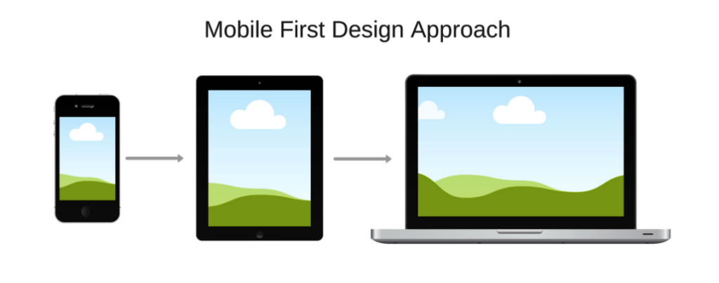
Mobile-first design is a strategy where websites are designed for smartphones before being expanded for larger screens. This approach reverses the traditional web development process, which originally prioritised desktop users.
Designing for mobile first offers several advantages:
- Improved performance
Mobile-first layouts focus on speed and efficiency, reducing unnecessary design elements that slow websites down. - Better user experience
Simplified navigation and clear content hierarchy improve readability on small screens. - Future-proof development
With smartphone usage continuing to grow, mobile-first websites remain relevant longer.
Businesses that prioritise mobile responsive design during development often find that desktop experiences also improve because the site structure becomes more organised and efficient.
Search Engines Reward Mobile-Friendly Websites
Search engine algorithms have adapted to modern browsing habits. Google now uses mobile-first indexing, meaning it primarily evaluates the mobile version of a website when determining rankings.
If a website performs poorly on smartphones, its search visibility may decline even for desktop searches.
Key ranking factors related to mobile responsive design include:
- Mobile usability
- Page loading speed
- Readable text and navigation
- Properly scaled images
- Avoidance of intrusive pop-ups
Websites that meet these criteria tend to rank higher because search engines want to deliver results that users can easily access on their devices.
This means mobile responsive design is not just about aesthetics—it directly affects search engine optimisation and organic traffic.
User Behaviour on Mobile Devices
Mobile users behave differently from desktop visitors. Their browsing sessions tend to be shorter, more focused, and often influenced by immediate needs.
For example, someone searching on a phone might be:
- Looking for a nearby business
- Comparing service providers
- Reading quick product reviews
- Making a fast purchasing decision
Because mobile browsing is often time-sensitive, the website must deliver information clearly and quickly.
A strong mobile responsive design supports this behaviour by ensuring:
- Contact details are easy to find
- Navigation menus are simple
- Pages load quickly
- Calls to action are visible
When mobile visitors can find what they need without frustration, they are more likely to remain on the website and take the next step.
Website Speed and Mobile Performance
Page speed has become one of the most critical factors in website success. Mobile users expect pages to load almost instantly, and delays of even a few seconds can significantly increase bounce rates.
Large images, complex scripts, and poorly structured code often cause slow loading times.
Optimising mobile responsive design helps improve speed through techniques such as:
- Image compression
- Efficient coding practices
- Reduced server requests
- Mobile-optimised caching
Fast websites not only improve user satisfaction but also support stronger search rankings and conversion performance.
Conversion Rates Depend on Mobile Usability
A website’s ultimate goal is usually to convert visitors into customers, subscribers, or leads. Poor mobile usability often prevents this from happening.
Common problems include:
- Buttons that are too small to tap
- Forms that are difficult to complete on phones
- Text that requires zooming
- Layouts that break on smaller screens
These issues create friction during the user journey.
A carefully planned mobile responsive design addresses these challenges by making interactions intuitive and accessible. Larger buttons, streamlined forms, and clear content layouts help visitors complete actions without difficulty.
As a result, businesses often experience higher conversion rates when mobile usability improves.
Mobile Design Builds Trust and Credibility
First impressions matter online. When users visit a website that looks outdated or poorly formatted on their phones, they may question the professionalism of the business behind it.
A polished mobile responsive design communicates reliability, attention to detail, and modern technical standards.
Visitors are more likely to trust businesses that present information clearly and professionally across devices.
This trust influences several key outcomes:
- Longer browsing sessions
- Increased engagement with content
- Greater likelihood of contacting the business
- Higher purchasing confidence
For marketing-conscious businesses, credibility plays a crucial role in brand perception and customer loyalty.
Common Mobile Design Mistakes Businesses Make
Even organisations that recognise the importance of mobile compatibility sometimes make critical design mistakes.
Some of the most frequent issues include:
Ignoring Mobile Navigation
Menus that work well on desktops may become confusing on small screens. Mobile navigation should prioritise clarity and simplicity.
Using Large Unoptimised Images
Heavy images slow down mobile loading times and consume unnecessary data.
Placing Important Content Too Low
Mobile users rarely scroll endlessly. Key information should appear near the top of the page.
Pop-Ups That Block the Screen
Intrusive pop-ups can frustrate users and may even harm search rankings.
Avoiding these problems strengthens the overall effectiveness of mobile responsive design.
The Business Impact of Mobile Optimisation
Investing in mobile responsive design delivers measurable benefits for businesses.
These advantages include:
Higher Search Visibility
Mobile-friendly websites align with search engine requirements and rank more competitively.
Improved Customer Engagement
Visitors remain on websites longer when navigation and readability are optimised.
Increased Conversion Opportunities
Simplified mobile interactions encourage more enquiries, purchases, and sign-ups.
Stronger Brand Reputation
Modern design signals professionalism and digital competence.
Companies that ignore mobile usability risk losing potential customers to competitors whose websites function better on smartphones.
Mobile Responsiveness and Future Technology
Technology continues to evolve rapidly. New devices, screen sizes, and browsing behaviours appear regularly.
Flexible mobile responsive design allows websites to adapt to future technological changes without requiring complete redesigns.
Emerging trends that reinforce the importance of mobile optimisation include:
- Voice search usage
- Progressive web applications
- Mobile-first search indexing
- Increasing smartphone processing power
As these technologies become more common, responsive websites remain adaptable and scalable.
How Businesses Can Improve Mobile Responsiveness
Improving mobile responsive design often requires collaboration between designers, developers, and marketing teams.
Practical steps include:
- Conducting mobile usability testing
- Analysing page speed performance
- Simplifying navigation structures
- Optimising images and scripts
- Ensuring forms function smoothly on smartphones
Regular testing across different devices helps identify issues before they affect customers.
Businesses that continuously refine their mobile experience maintain a strong digital presence in competitive markets.
Why Marketing Teams Must Prioritise Mobile Design
Marketing professionals focus heavily on generating website traffic through advertising, search optimisation, and content marketing. However, if visitors arrive on a poorly optimised mobile site, that traffic may produce little value.
A strong mobile responsive design ensures marketing investments translate into meaningful engagement.
Campaigns that drive mobile visitors benefit from:
- Faster landing pages
- Clear calls to action
- Improved lead generation
- Higher customer retention
Without mobile optimisation, marketing budgets may deliver disappointing returns.
The Competitive Advantage of Mobile-Ready Websites
In many industries, businesses still underestimate the importance of mobile usability. This creates an opportunity for forward-thinking companies.
A well-executed mobile responsive design can differentiate a brand from competitors whose websites remain difficult to navigate on smartphones.
Customers tend to choose businesses that provide convenient digital experiences. Even small improvements in usability can influence purchasing decisions.
By prioritising mobile-first design, companies position themselves as modern, accessible, and customer-focused.
Mobile browsing has permanently changed how people interact with websites. Businesses that continue designing primarily for desktops risk falling behind both competitors and search engine expectations.
A strategic investment in mobile responsive design improves user experience, strengthens search performance, and increases the likelihood of converting visitors into customers.
For marketing-conscious organisations, mobile optimisation is no longer optional. It has become a foundational component of digital success.
Seamless mobile experience
If your business website is not delivering a seamless mobile experience, it may already be losing potential customers. Modern users expect fast, easy-to-navigate websites that work perfectly on every device.
The Gold Coast Directory helps businesses improve their online visibility and connect with customers searching for reliable services. Listing your company in a trusted directory strengthens your digital presence and supports better discoverability in search results.
Visit Gold Coast Directory today to showcase your business, improve online exposure, and reach customers who are ready to take action. Your website’s success begins with visibility—and mobile-ready businesses are the ones customers find first.